Tone Mapping Considerations for Physically-Based Rendering
By Emmett LalishTable of Contents:
The purpose of tone mapping
Tradeoffs
The needs of e-commerce
Khronos PBR Neutral tone mapper
Validation
OpenColorIO profile
Adoption
White point
The purpose of tone mapping
Tone mapping is a general term, which can refer to basically any color conversion function. Even separate operations that a photographer might apply in post processing, such as gamma correction, saturation, contrast, and even things like sepia can all be combined into a single resulting function that here we're calling tone mapping. Setting aside artistic color grading, we are looking at generic, neutral tone mappers designed to pull out-of-range colors back into the limits of our display device in a perceptually-pleasing way.
The default tone mapping function used by
<model-viewer> has been ACES, which is a standard
developed by the film industry and is widely used for 3D rendering, though
it has some problems. Like most tone mapping curves, it is fairly linear in
the central focus of its contrast range, then asymptotes out to smoothly
compress the long tails of brights and darks into the required zero to one
output range, the idea being that humans perceive less difference between
over-bright and over-dark zones as compared to the bulk of the scene.
However, since some output range is reserved for these extra-bright
highlights, the range left over to represent the input range of matte
baseColors is also reduced. This is why a paper-white material does
not produce white pixels.
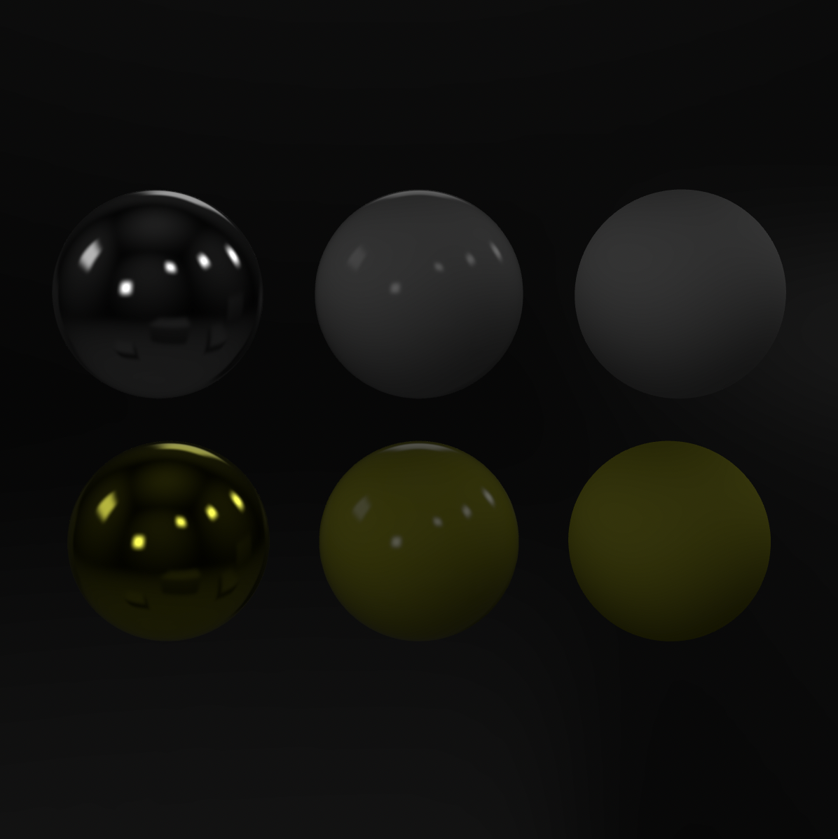
Sometimes when working with matte objects and trying to compare output color to baseColor, this tone mapping compression will be noticed and identified as the source of the apparent tone discrepancy. The immediate thought is usually, let's fix this by not applying tone mapping! The problem is there is actually no such thing as "no tone mapping", since somehow the unbounded input range must be converted to the zero-to-one range that the encoder expects. If this step is not done, the encoder simply clamps the values, which amounts to a piecewise-linear tone mapping function with sharp corners that introduce perceptual errors for shiny objects, as shown in the example below.
This model has six spheres with uniform materials: The top row are white (baseColor RGB: [1, 1, 1]), while the bottom row are yellow (baseColor RGB: [1, 1, 0]). From left to right they are shiny metal (metalness: 1, roughness: 0), shiny plastic (metalness: 0, roughness: 0), and matte plastic (metalness: 0, roughness: 1). The left-most can be thought of approximately as polished silver and gold.
Tick the checkbox to remove tone mapping for a quick comparison. Note that the shiny and matte white plastic spheres are now indistinguishable. Since half of the matte white sphere is now rendering pure white, there is no headroom for shiny highlights. Likewise, the top half of the sphere loses its 3D appearance since the shading was removed by clamping the values.
This example also highlights a second key element of good tone mapping functions: desaturating overexposed colors. Look at the golden sphere (lower-left) and compare to when ACES tone mapping is applied. The baseColor of a metal multiplies the incoming light, so a white light on a golden sphere produces a yellow reflection (fully saturated yellow, in this case of a fully saturated baseColor). With clamped tone mapping, the highlight is indeed saturated yellow, but this does not look perceptually right, even though you could make the argument it is physically correct.
Tone mapping curves like ACES not only compress the luma, but also push colors toward white the brighter they are. This is why the highlights on the golden sphere become white instead of yellow. This follows both the behavior of camera sensors and our eyes when responding to overexposed colored light. You can see this effect simply by looking at a candle's flame or a spark, the brightest parts of which tend to look white despite their color. Nvidia has helpfully provided more details on tone mapping and HDR for the interested reader.
One final way to avoid tone mapping that is sometimes suggested is to choose an exposure such that all pixels are inside the [0, 1] range, such that value clamping is avoided. For matte objects with low-dynamic-range lighting, this can give semi-decent results, but it breaks down completely for shiny objects, as shown in the following screenshot.
The trouble is that the specular highlights are orders of magnitude brighter than the majority of the scene, so to fit them into the output range requires the exposure to be lowered by more than a factor of 50. This kills the brightness and contrast of the majority of the scene, because of just a few small highlights. And this neutral environment does not have very high dynamic range; if you were to use an outdoor environment that includes the sun, the exposure would have to be so low that nearly the entire render would be black.
Everything shown here is rendered to an 8-bit sRGB output, but HDR displays and formats are getting more common. Might we be able to avoid tone mapping by keeping the HDR of our raw image in an HDR output format? The short answer is no, because HDR displays may be high dynamic range compared to traditional SDR, but they are still orders of magnitude short of what our eyes experience in the real world, so all the same reasons for tone mapping still apply. However, it is important to note that the choice of tone mapping function should be dependent on the output format. Ideally it would even depend on the display's contrast ratio, its brightness settings, and the level of ambient lighting around it, but this data is unlikely to be available.
Tradeoffs
The difficulty with compressing a nearly infinite HDR range down to sRGB is the necessary loss of information. For the highlights to be discernable, the neutral contrast must be reduced, so a paper-white object must appear dimmer than 255 under diffuse lighting. For the highlights to desaturate appropriately and smoothly, the highest saturation colors of sRGB become unreachable under any lighting.
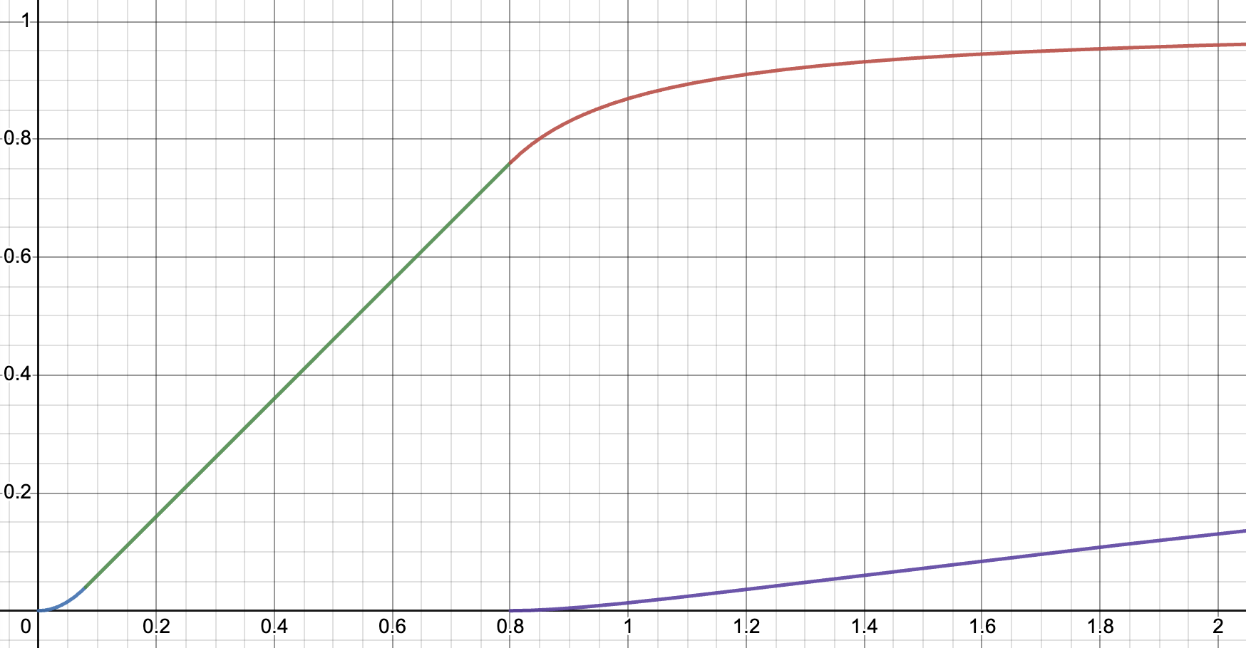
The primary problem with ACES (and even AgX) tone mapping reported by e-commerce users is their significant loss of saturation. Many artists have been frustrated by their inability to produce a desired product color (generally dictated by marketing) with any combination of material properties and lighting, but few have realized that the tone mapping function is in fact the limiting factor. For example, the following figure shows the reachable set of ACES tone mapping, assuming sRGB inputs and outputs for both material properties and lighting, as specified by glTF.
Tone Mapping Function
Note that canary yellow, bright greens and blues are all impossible to output to the screen. This is partly because ACES comes from the film industry, where inputs may often be wider-gamut than sRGB, thus making more of these colors reachable. It is also because in film, the image detail is important across a wide spectrum of the HDR input range, so it makes sense to sacrifice more saturation for the sake of smoothly compressing a larger range. Finally, in film, the viewer is generally immersed, so the brain has no bright surrounding colors to compare to. This allows our perceptual system to compensate for the loss of saturation, allowing the image to still look good, instead of washed-out.
The needs of e-commerce
Unfortunately, the needs of e-commerce are quite different than the needs of film or gaming. On a website, a 3D product model will be side-by-side with sRGB product photos, and a user may often compare the image on their screen to a printed image in a catalogue or to the physical product they have received. Of course it is exceedingly difficult to succeed in these comparisons, as there is no way to match the user's lighting environment to the photo studio's, nor to make a catalogue or screen emit light with the same intensity as a real-world reflection.
What we can do is leverage the existing tools, processes, and experience of the artists, photographers, and marketers to match their existing product photography pipelines where they have been working to solve these problems already for years. The best way to make this easy for them is to ensure the baseColor assigned in the glTF shows through faithfully in the final render under neutral (grayscale) lighting. Faithful does not mean unchanged - certainly the brightness must vary to represent realistic shadowing and reflection, while metallic highlights must desaturate. However, hue should remain unchanged (except of course in the presence of colored, e.g. outdoor, lighting) and saturation should be retained as much as possible.
The reason for adhering to the baseColor is simplicity and expediency: when product colors are updated, it will be much easier to modify and verify the sRGB values in the textures where they are relatively uniform, than in the final render where they vary greatly with lighting. And when a product render doesn't look "right", one can have confidence in the model and only vary the lighting to achieve the proper look, just as a photographer would. This allows for a convenient separation of concerns between product (model) and marketing (lighting).
Commerce is much less interested in the detail of bright HDR regions. Studio lighting is intentionally crafted to avoid overexposure and focus on the important details of the product. While the brightness of highlights are orders of magnitude higher than sRGB, they are generally just the outlines of lights, whose blurred edges key our perception of the material's shininess. Details within this bright light are not important, so aggressive compression of the range of these highlights is much more reasonable than in film.
We are focused on sRGB for both input (glTF) and output (web browsers), to meet the industry where it is today, which simplifies the tone mapping problem considerably compared to the film industry. This is because one of the most difficult aspects of tone mapping is gamut mapping, where colors from a larger input gamut like P3 must be squeezed into a smaller gamut like sRGB. Conveniently, the glTF standard (like most 3D model workflows) specifies that all color textures and lights are in the sRGB gamut. This means that regardless of the colorspace used internally, all rendered colors will automatically be inside the sRGB gamut (Rec.709), though potentially at much higher brightness. Even if the display device is not sRGB, since sRGB uses the smallest color gamut, no gamut mapping will ever be required, until 3D models contain larger-gamut textures.
HDR monitors are working their way into the mainstream and we will need to adjust our curves appropriately to support their higher contrast. The approach to tone mapping outlined in the following section should be generalizable to these situations, but there will be additional challenges beyond tone mapping as well.
Khronos PBR Neutral tone mapper
The Khronos PBR Neutral tone mapper is designed to be simple to implement, fast to run, and faithfully reproduce color as much as possible while eliminating HDR artifacts around highlights. It is intended to be 1:1 for colors up to a certain maximum value, with the remainder used as headroom for the compressed highlights. I developed it under the auspices of the Khronos 3D Commerce working group to create an industry standard for e-commerce and an improved alternative for any PBR render that currently disables tone mapping.
I found that an actual 1:1 tone mapping function led to slightly desaturated colors, most noticeably for dark colors. I tracked this problem down to PBR itself: for a common dielectric material with index of refraction of 1.5, the normal Fresnel reflection adds 4% of the incident light color (the highlight) to the material's colored diffuse reflection. Assuming the lighting is even and white, this leads to a 4% desaturation of the rendered color as compared to the baseColor. This is physically correct, but confusing from a color-management perspective.
I correct our saturation by shifting the 1:1 portion of our tone mapping curve down by 0.04. Even though this only exactly corrects the average case, it does a very good job overall. This has the useful secondary effect of giving us a place to add a contrast "toe", which is a common element of most tone mapping functions that helps the blacks look better. I built this toe by fitting a simple quadratic function to match our piecewise slope.
Since tone mapping is about fitting into the sRGB cube, I intentionally avoid any use of luminance weights, as the edges of the sRGB cube are not at all constant luminance. Instead I scale down colors by a scalar multiplier, thus preserving hue and saturation while reducing brightness (there are many definitions for these terms, so please bear with my imprecision). The brightness metric I use is the maximum value of R, G, and B, and the goal is to smoothly reduce this metric to the 0-1 range.
I chose to fit a simple 1/x function and match the piecewise slope of our 1:1 portion, as this gives an asymptote with a reasonable tail. It has only a single parameter: the value where we switch from the linear to the nonlinear function. The purpose of the Khronos PBR Neutral tone mapper is to be a standard and thus without parameters, so I chose 0.8 after much testing. However, this is likely the most natural place to adjust the curve to HDR output from sRGB.
Converting 0.8 to sRGB gives 231, so any baseColor with R, G, and B values below 231 will be faithfully reproduced under even, white lighting. The compression reduces 255 to 243, so all highlights that would be clipped end up mapped to the 243-255 range.
The final piece is to create the path to white for desaturating bright highlights. This is particularly important for matte materials and shiny metals, as they physically color the light they reflect, but perceptually that color is lost when it is sufficiently bright. I accomplish this by taking a convex combination of the compressed color and white, only in the nonlinear compression region. In fact, "white" is slightly darkened in order to maintain constant brightness with the compressed color, which makes this tone mapper easily invertible.
The convex parameter function I chose is another 1/x, this time based on the amount of brightness removed in the compression step, which ensures it starts smoothly with a zero derivative where it begins to take effect. The only other parameter in this tone mapper controls the rate of desaturation, which I chose as 0.15, which is significantly slower to approach its asymptote than the compression function. This is what helps produce our smoother gradients and hide the aggressiveness of our compression. In a sense I am replacing the lost brightness with desaturation, thus giving the brain an alternate perceptual cue, which smoothly encodes several orders of magnitude more brightness than is available in the output screen.
Careful use of the minimum and maximum of the three color channel values
ensures that this tone mapping function has continuous gradients everywhere
and in all dimensions, which is key to avoiding eye-catching artifacts in
the output renders. The complete shader code is quite small, with only three
divides and those only applied to colors over the 1:1 limit:
  float startCompression = 0.8 - 0.04;
  float desaturation = 0.15;

  vec3 CommerceToneMapping( vec3 color ) {
    float x = min(color.r, min(color.g, color.b));
    float offset = x < 0.08 ? x - 6.25 * x * x : 0.04;
    color -= offset;

    float peak = max(color.r, max(color.g, color.b));
    if (peak < startCompression) return color;

    float d = 1. - startCompression;
    float newPeak = 1. - d * d / (peak + d - startCompression);
    color *= newPeak / peak;

    float g = 1. - 1. / (desaturation * (peak - newPeak) + 1.);
    return mix(color, newPeak * vec3(1, 1, 1), g);
  }
The following demo uses a test model based on a Macbeth color chart. For each color, there is a matte sphere, shiny dielectric sphere and an unlit sphere for baseColor comparison. Along the top is an additional row with saturated colors and shiny metallic spheres - this is useful for demonstrating the problems with Linear/Clamped tone mapping - note the extreme hue skews of the highlights. Along the left and right are columns of shiny metals.
Try the different tone mappers under both neutral and outdoor lighting. This test is intentionally designed to show off HDR artifacts.
Tone Mapping Function
Lighting
Exposure: 1
Validation
The best end-to-end validation we have for color accuracy is to apply an unrealistic, analytic lighting environment: a white furnace test, where the lighting is exactly uniform [1, 1, 1] white everywhere. This allows us to expect a nearly-exact reproduction of baseColor to the output render, and thus ensure our tone mapping function is not introducing further changes.
Our 3D Macbeth chart model is ideal for this validation because tone mapping is not applied at all to unlit materials, so the unlit spheres serve as ground truth color comparisons for the PBR spheres. As you can see, they match very well, in fact as close as is possible to match for PBR: there are two expected sources of difference.
The first difference is due to multi-scattering, which causes the dark-colored matte (front) spheres to be slightly darker than their unlit comparisons. This is intentional, as matte materials are rough, thus forming microscopic cavities that cause slight ambient occlusion and allow dark materials more light bounces to absorb energy. Accurate PBR renderers include this effect because a single material will in fact become brighter as it is polished.
The second difference is from the Fresnel effect: on shiny materials, the reflection loses material color near grazing angles. This is a physical reality and causes the white halos on the edges of the shiny (back) spheres. If you turn the model until the unlit spheres overlap the middle of the shiny spheres, you'll see that the color match is exact at normal (center) reflection.
OpenColorIO profile
OpenColorIO Is a standard for representing color space conversions and color grading, supported by many 3D authoring tools. To represent the most general possible functions, instead of specifying equations they use 3D lookup tables (LUTs). To help authors try out Khronos PBR Neutral tone mapping within their existing workflows, I have generated an equivalent OCIO config and a LUT in the common .cube format. You can download pbrNeutral.cube and config.ocio, which is modified from the Blender config to add PBR Neutral as a view transform for color management with an sRGB display device.
In order to try PBR Neutral tone mapping in Blender, you need to replace the
config.ocio file with the above version. The original file can be found in
the Blender install directory, e.g.
Blender/Contents/Resources/4.0/datafiles/colormanagement on a
Mac install. You will also need to add pbrNeutral.cube to the
luts directory on the same path. Then start Blender and at the
bottom of the Render tab, under Color Management, select sRGB for Display
Device and PBR Neutral for View Transform.
I have tested this on a Macbook Pro, which uses a P3 display, but found that I achieved consistent colors when setting the display device to sRGB. This was to achieve consistency with Chrome and Safari rendering on the same device, so this may change in the future as color management on the web improves. Note that unlike <model-viewer>, Blender also applies its view transform to unlit materials. This makes the 3D Macbeth model above a little harder to use, as the unlit spheres can no longer be used as a reference.
The critical addition to the Blender OCIO config is the following, but this will likely need some modification to fit into an existing OCIO config in a different tool that has colorspaces defined under different names.
- !<ColorSpace>
  name: PBR Neutral sRGB
  family: PBR Neutral
  equalitygroup:
  bitdepth: 32f
  description: |
    Khronos PBR Neutral Image Encoding for sRGB Display
  isdata: false
  from_scene_reference: !<GroupTransform>
    children:
      - !<ColorSpaceTransform> {src: Linear CIE-XYZ E, dst: Linear Rec.709}
      - !<AllocationTransform> {allocation: lg2, vars: [-6, 12]}
      - !<FileTransform> {src: pbrNeutral.cube, interpolation: tetrahedral}
      - !<ColorSpaceTransform> {src: Linear Rec.709, dst: sRGB}
Adoption
Of course a standardized color-accurate tone mapper is most useful when it is universally available, so that everyone from artists to marketers to end users can see the product the same way and ensure quality. This is precisely why Khronos is pushing this as an industry standard for renderers and authoring tools alike to adopt, as an option for tools that support multiple tone mappers, and as the default for those that don't. This section will be occasionally updated to reflect our progress in adoption across industry tools.
So far two major open-source renderers have added PBR Neutral tone mapping, and both should be available in public releases in March 2024: Three.js and Filament. <model-viewer> already supports it, currently under the name "commerce", and it will become default in v4. It is already the default in the <model-viewer> editor. A proposal has been made to add it to Blender, and discussions are ongoing with other major 3D authoring tools.
White point
The tl;dr of this section is that you can safely skip it. It is a discussion of the difference between physically correct and practical approaches to color management.
In developing this tone mapping function while addressing the needs of our own GStore, I found some peculiar data. I had always said the best way to choose the baseColor of your product material (we'll assume it is a simple, uniform color for now) was to scan it with a calibrated spectrometer under a controlled lighting environment. It turns out GStore does exactly this with all their Pixel products. However, they also have a marketing team that decides on correct sRGB colors to display for each product, using a person with a calibrated monitor in a light-controlled room and the product in-hand.
These colors did not match. And not just brightness - even the hue varied significantly, at least to an artist's eyes. Which should we use? Like in most e-commerce shops, marketing makes the rules, and their color must be followed. But it bothered me; these differences were not random, like possible variations in human perception. What was causing the discrepancy?
Finally I realized the root of at least most of the problem, when it occurred to me that all the marketing colors were generally red-shifted from the scanned ones. The white point of sRGB is D65 (the white point of your monitor), or 6500K if you've ever shopped for a lightbulb. The lighting marketing used with their calibrated monitor room was D50, to match the 5000K bulbs they have in their retail stores, which is significantly yellower.
To achieve PBR realism, we would need not grayscale lighting, which is D65 per the sRGB spec, but yellow D50 lighting. At first I championed this approach as the most physically-correct. However, all of our technical artists balked at this idea - it was hard to explain, meant keeping track of multiple colors, and introduced many places errors could subtly enter the pipeline.
We decided instead to take the practical approach of using the marketing-approved color as baseColor, with simple grayscale lighting to avoid skewing it. This isn't exactly correct according to PBR and the sRGB white point, but I think you'll find it very hard to detect the error. Considering other much bigger approximations we have baked in like operating on three colors instead of using a spectral renderer, smaller things are worth ignoring.
However, when measuring color, remember that colorspace and white point are very important, and while a tool may be precise, it is hard to beat the accuracy of a person's calibrated eyeball, as long as their setup is well-controlled.