Achieving Color-Accurate Presentation with glTF
By Emmett LalishTable of Contents:
What is color accuracy?
What's wrong with the rendered color matching the baseColor?
How does rendering compare to photography?
How do we validate a glTF 3D render?
What role does perception play?
How do we validate a glTF model?
What's the takeaway?
Interactive 3D models are the next media type, following images and
video, and as such <model-viewer> and other renderers are
being used more often to display these 3D models in commercial settings,
museums, and many more. Both of these users have deep interest in ensuring
the presented pixels accurately represent the real object the model is based
on. As such, a quality assurance process is needed to ensure that both the
3D model itself has been designed accurately, and that the presentation of
that model is appropriate for realism. While your process may differ based
on your situation, this document is intended to give the background
necessary to set up a process and to set expectations.
Khronos' glTF is the first 3D model format to specify physically-based rendering (PBR), meaning it contains material properties that define in real-world units how light should be reflected & refracted in terms of physics. This means renderers are free to innovate in GPU shaders to create more and more accurate approximations of the underlying physics, because glTF does not specify any single approximation. This also means that while different renderers may make different tradeoffs of accuracy vs. speed you can have confidence that your glTF will look consistent (though not pixel-identical) even across unrelated codebases. We call glTF the JPEG of 3D because it is compressed for efficient web delivery and can be rendered consistently by a large number viewers.
At first blush, it may appear that different glTF viewers are not consistent, but this is generally not due to rendering differences, but to default scene setup. Physically-based rendering means the scene takes environment light as input just like a real camera does, so just like to get a consistent photo, you need to not just have the same object, but also the same lighting and camera settings. There is no standard for the default settings of these viewers, so it is important to intentionally set them to consistent values. This is precisely what we and Khronos have done to show the state of glTF rendering convergence across a variety of popular renderers.
What is color accuracy?
The goal of PBR is to create color-accurate images at frame rate as a user interacts with the 3D model. Of course a renderer can only be as accurate as the input 3D model, so a process to decide if the 3D model is in fact accurately representing the real-world object it's based on is also crucial, so any errors can be fixed. The most correct way to do this would be to set up a photo shoot of the real object, capture the environment lighting around it in its full dynamic range, record the camera settings and position, then set up an identical rendered scene and compare the output images. Unfortunately this tends to be prohibitively expensive.
Even in this idealized comparison scenario, there is a non-trivial issue: what metric does one use to compare the images? Simple pixel comparison metrics like PSNR tend to give too much weight to differences that are not noticeable. Thus perceptual metrics are better, but also more arbitrary and harder to define.
Since many products are designed with RGB material specs (like paint), a common idea is to simply reflect this in the baseColor of the glTF. This can be a good approach to color-accurate modeling, provided the RGB value is in the proper color space. The glTF spec says the baseColor factor (normalized between zero and one) is exactly the fraction of the given channel (wavelength) of light reflected by the material. The baseColor texture is the same, but put through the sRGB transfer function to extract linear values first. It should not be assumed that a given paint swatch RGB value is defined the same way.
When it comes to verifying that the render is color-accurate, the first idea is often to check that the output rendered image has the same RGB pixel values as the glTF baseColor (or the expected paint swatch RGB). This is a fundamentally incorrect expectation, as it negates the purpose of physically-based rendering! Details and examples follow to support this assertion and to point the way towards a more useful verification scheme.
What's wrong with the rendered color matching the baseColor?
The most important thing to understand about PBR is that it accurately represents the interplay between incident light and material properties, of which there are several beyond just baseColor, the most important of which are metalness and roughness. However, the rendered output for a given pixel is only RGB, which means if it matched the baseColor RGB, then by definition the incident light and other material properties could not in any way affect the resulting image.
Let's start with a simple example: six spheres with uniform materials. The top row are white (baseColor RGB: [1, 1, 1]), while the bottom row are yellow (baseColor RGB: [1, 1, 0]). From left to right they are shiny metal (metalness: 1, roughness: 0), shiny plastic (metalness: 0, roughness: 0), and matte plastic (metalness: 0, roughness: 1). The left-most can be thought of approximately as polished silver and gold.
Note how different materials with the same baseColor render differently. Which pixels match the baseColor RGB? In fact, if you really want the rendered pixels to match the baseColor RGB values, glTF has an extension specifically for this: KHR_materials_unlit. This extension is not physically-based, and so is appropriate for things like labels and 3D scans that produce only RGB textures with all applied lighting baked in as part of the capture process. This is how the above model looks with the unlit extension:
Now that it's clear that lighting is important in making a 3D model look realistic, the next common idea is to choose a nice uniformly neutral lighting scenario to make the output RGB values "close to" the intended baseColor. Well, it's easy to produce a uniform lighting environment, but the results may be surprising for PBR:
It may look like the white spheres have vanished, but they're still present - tilt the view and you can see them occluding the yellow spheres. In fact they are just perfectly camouflaged. This scene is known as a furnace test, which is used to check energy conservation of the renderer, which ours passes. It can be shown with physics that under perfectly uniform lighting, these white spheres should each uniformly reflect exactly the same light as is incident from the environment, and hence be indistinguishable from the background.
Note this result with the yellow spheres is actually pretty close to the unlit result - there's almost no discernable difference between shiny and matte or metal and plastic. This is in fact accurate; if you really found a place with perfectly uniform lighting, you wouldn't be able to tell the difference between those materials either (assuming you could somehow also hide your own reflection - you are also a part of your lighting environment). The reason this looks so unreal is that it is nearly impossible to find an environment like this. Real environments have texture, and the reflections of that texture are what we use to understand shininess.
Next let's return to the original version, which uses
<model-viewer>'s default "neutral" environment-image. Details of
how this environment was designed can be found here and here. The
lighting is intended to be even (from all sides), though not uniform, thus
providing enough texture to discern material types. It is purely grayscale,
thus not shifting the hues of the materials. This is as opposed to indoor
lighting which might skew yellow, outdoor that might skew blue, or sunsets
that might skew red. PBR will faithfully produce the colors a camera would
capture in these scenarios, which of course will look different than the
same object under neutral lighting.
Exposure:
Note that the top-right ball we might call paper-white: a perfect matte reflector. However, despite the white baseColor (sRGB: [255, 255, 255]), notice that the rendered color varies from [177, 177, 177] to [237, 237, 237], never achieving pure white. Why is this? Notice that the top-middle ball does have some reflections off its shiny surface that are pure white. These specular reflections are in addition to its diffuse reflection (which is all you get from a matte surface), so if the diffuse reflection had already saturated our pixels, it would be impossible to discern a shiny object from a matte one. Try increasing the exposure slider to see the effect, which in photography is referred to as overexposure.
You might notice that exposure appears to affect the midrange values more than the blacks and whites (despite exposure being a linear light multiplier). You would be correct, and this is caused by the nonlinear tone mapping step that happens last in the rendering pipeline. Tone mapping is a complicated topic in its own right, but it is vital to understanding PBR. Before we get into that, let's begin by comparing the rendering and photography pipelines.
How does rendering compare to photography?
3D rendering, especially PBR, is designed to mimic photography, and photography in turn is designed to mimic the human eye and brain. The brain part is essential, as the goal of a realistic photo is to evoke the same perception by looking at it as one would have looking at the original scene. This is difficult as the light reflected by a printed photo or emitted by a display is dramatically less intense and has less contrast than the real world. Even HDR displays have orders of magnitude less contrast than your eye sees on a normal outdoor day.
Thankfully, our brains do a lot of adjustment to our perception, including correcting for contrast. This allows us to print photos with a very compressed dynamic range while still giving the perception of e.g. a real sunset. This compression of dynamic range we'll refer to as tone mapping. In photography you can think of this as the conversion from the camera's raw image (which tends to look washed out) to the final image. It becomes even more important in modern photography with exposure stacking, where a higher dynamic range raw image can be produced than the sensor is capable of in a single shot.
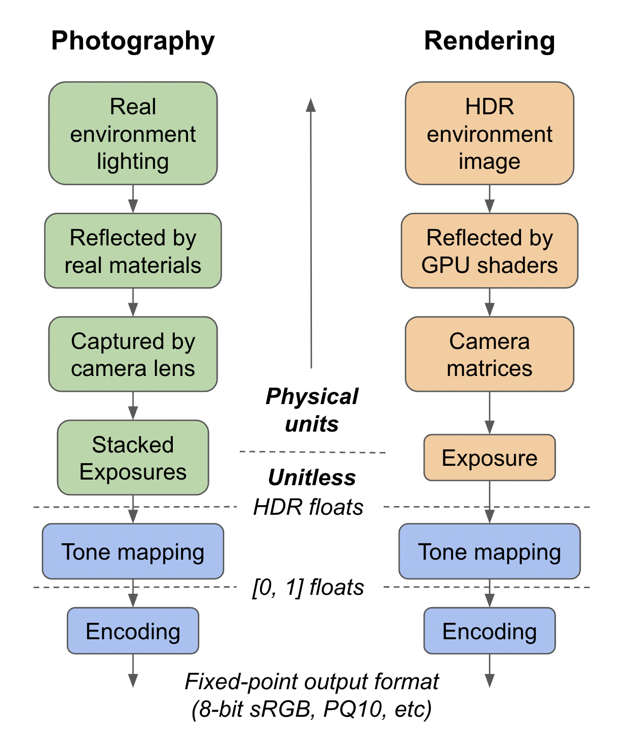
In 3D rendering, there is no sensor and computations are done in floating point, which means the raw image is effectively full HDR, with even more range than is generally possible with exposure stacking. Looking at a histogram of this raw image will often show a very long tail, representing the small, shiny glints that are orders of magnitude more intense than the rest of the scene. In order to maintain perception while compressing down to SDR, a nonlinear tone mapping curve is used.
Tone mapping comes at the difficult intersection between art and science. We have found through painful experience that the existing tone mapping functions do not meet the needs of e-commerce for color-accuracy, and so we have developed the Khronos PBR Neutral tone mapper for exactly this purpose. If you have precise sRGB color swatches that you have used to create your glTF materials and want them to come through as unaltered as possible, we strongly recommend using our "neutral" tone-mapping function and our default lighting or another suitable grayscale lighting environment.
Below is an example where you can see first-hand how much difference tone mapping makes. ACES has been a defacto standard in the PBR industry for some time, but it should be easy to see its serious flaws, including both hue skews (blue to purple, red to orange) and saturation loss. AgX is a newer and better tone mapper that holds hue better, but still has significant contrast and saturation loss, which is desirable for its intended use cases in games and film. For detail, please see our technical document on the tradeoffs in tone mapping and how our Commerce tone mapper was designed.
Tone Mapping:
Model:
How do we validate a glTF 3D render?
Hopefully the preceding discussion has convinced you that simply validating some rendered pixel color against the object's "correct" color is not a useful or valid process. If only it were so simple! Instead you need to look at your whole pipeline and consider what your end goals really are.
For the sake of measurability, let's consider the end goal to be minimizing the return rate of products bought online where the shopper's primary visual cue is a 3D model (let's assume we're making a decent enough render that we're not destroying the purchasing rate). To succeed, we must render images that the shopper perceives to be equivalent to their perception of the actual product when it arrives. This is exactly the same goal as a photograph of this product in a magazine or on a website.
There is a much longer history of product photography, so let's start there. What does a product photographer's pipeline look like? Obviously they vary, but the overall steps will tend to look like: 1) lighting setup, 2) camera setup, 3) take the photos, 4) post-processing. Ideally, it is possible to capture this lighting environment, convert the camera setup to matrices and exposure, use the same post-processing, author the glTF according to measured material properties, and output a render that will match the photo quite well (especially with a path-traced renderer).
It is tempting to blame any observed discrepancies on the renderer, especially real-time rasterizers, but in fact a lot of research has gone into making them amazingly physically accurate and consistent, as you can see in our fidelity comparisons. Nearly always the most serious errors are differences in lighting, materials, exposure, and post-processing.
Let's consider for a moment what happens in the photography post-processing step. Some things don't apply to rendering, like masking out shadows to make them semi-transparent - a 3D renderer can do this automatically. In addition to color-neutral tone mapping, sometimes the colors are intentionally "corrected". Why? After all, if the captured light from the actual scene is not correct, what is?
It may be that some of the post-processing color correction is simply a matter of expediency. Before digital photography, to get the right look, the lighting and scene had to be adjusted, which involves manual labor. Digital post-processing can allow the lighting to be less precise. However in 3D rendering, the lighting is equally digital, so it is generally a better practice to keep the post-processing step simple (e.g. just tone mapping) and adjust the environment image if necessary. Since 3D rendering is happening completely automatically in real time, there is no way to make manual bespoke color adjustments for each frame.
What role does perception play?
As with photography, the goal is the viewer's perception of the image. There is no mathematical metric that will represent human perception as well as the perception of an actual human. Isolated pixel metrics are problematic because much of human perception is affected by the background and surroundings of the object. This is because our brains are effectively trying to remove the effect of lighting and allow us to perceive the underlying material properties consistently. Our brains estimate what lighting to remove based on the background.
When rendering a product in AR using the camera image as the background, to get the most consistent perception of the product, its actual rendered pixels need to change color, ideally according the actual local lighting environment. This helps ensure that when our brain "corrects" for the lighting, our perception returns to the real object's properties. Of course this is only as good as the AR lighting estimation algorithms, but they are improving. Ideally, the same tone mapping and white balance that's applied to the camera's raw image should be used in the rendering pipeline as well. Unfortunately, it may be difficult to access this data.
Of course human perception is not uniform, which makes all of this even more difficult. An excellent example is the famous dress photo which is actually a blue and black dress in an overexposed photo under yellow lighting. Even though the pixel colors are roughly purple and brown, more than half of people correctly perceived the dress as blue and black, though another 30% perceived it as white and gold. Obviously this kind of ambiguous image is not desireable in a commerce setting, but it is useful for understanding how much perceived color can differ from pixel color. The Scientific Explanations sections of that article is full of interesting insights.
How do we validate a glTF model?
Generally speaking, part of the purpose of 3D rendering is to avoid the cost of photography, by making the entire process digital. The 3D model is costly for an artist to create, but it persists for creating many different photo shoots and interactive experiences quickly. So how can this 3D model be verified as accurate to the physical product? Of course dimensions and shape can be measured (glTF is always in meters, so check your units), but we'll be focusing on material properties here, like baseColor and roughness.
The most accurate way to choose material properties is to measure them, since all glTF materials are defined in physical terms. However, these measurements are difficult to make. There are products on the market that will scan an inserted material swatch and fit these properties to it, and hopefully these machines will become more common. Modern 3D scanning algorithms can back out material properties, but these machine learning systems are not perfect and are difficult to benchmark. Until these technologies are further along, we may not have access to properly measured material properties.
The most common workflow for creating materials is that a 3D artist manually adjusts the properties until the render looks right. Ideally the artist has the physical object on their desk and compares to their render, thus focusing on perception rather than pixel values. However, it is of utmost importance that their authoring software is set up to render the same way as the object will be presented to users. This is because when the render doesn't look right, it could be that either the materials or the lighting needs to change. If the materials are measured one can safely focus on changing the lighting, but if not, it is very helpful to have chosen a fixed lighting environment ahead of time to remove that variable. Equally important is that the tone mapping function used is consistent. If you're not sure what is being used, it's probably inconsistent.
Ideally the artist should check the rendering of the model under a variety of lighting environments. Certain types of lighting will tend to hide or expose certain material property errors. At minimum, it's a good idea to test with both a neutral indoor environment and with a sunny outdoor environment. The sun will produce very high dynamic range, as well as colored lighting, which will help with detecting a variety of possible material problems. These scenarios will tend to bracket a wide variety of real lighting situations that might be applied for a virtual photo shoot or in AR, which should give confidence the asset can be reused broadly.
Finally, all the usual caveats apply regarding colorspaces and differences between displays. The glTF format specifies the use of the sRGB colorspace internally, which is also the most common output format, but with HDR displays becoming more common this is likely to become more complicated soon.
What's the takeaway?
Unfortunately there are no easy answers, as color and perception are complex, even more so than physically-based rendering. Hopefully this background gives a framework on which your authoring and validation processes can be built. The most important thing to remember about PBR is that the whole point is for the rendered colors to vary compared to the material baseColor, which is what allows the demo below to be compellingly realistic.
Still, for most e-commerce vendors that are likely managing separate contracts for 3D model creation and interactive website design, simplicity is key to cost-effectiveness. My recommendation is to use our PBR Neutral tone mapping and if you already have approved marketing colors for your products, then tell your artists to use those for the baseColor. Use a grayscale lighting environment (like our default), adjusting if necessary to place highlights and change exposure.
If the color is not known, but being matched by eye, then ensure the
artist's tools also use the Khronos PBR Neutral tone mapper and a lighting environment
that is as close as possible to the production grayscale lighting
environment. Since our PBR Neutral tone mapper is relatively new, it may not be
available in tools; in this case the next best thing is to turn off tone
mapping entirely. Make sure to educate your artists on the differences they
can expect - blown out highlights with hue skews, and saturation loss for
dark colors. Ensure they also frequently test their output in a
near-production environment, hopefully using <model-viewer> with
tone-mapping="neutral". This way they can calibrate and ensure
the end user will see realistic colors.